
Key Takeaways
- Most statistics fail because they lack context and a clear implication; they fail the ‘Journalist Screenshot Test’ by not being understandable in seconds.
- The S+C+I+S&M framework (Statistic + Context + Implication + Source & Methodology) is the blueprint for creating data that journalists and link builders crave.
- A headline-worthy Statistic (S) must be specific, surprising, and use a meaningful metric (%, $, ratio).
- Context (C) transforms a generic number into a defensible fact by specifying the Who, What, When, and Where (e.g., ‘78% of companies’ vs. ‘78% of Fortune 500 COOs in Q4 2024’).
- Source & Methodology (S&M) is non-negotiable for trust. Transparency about your process is what earns credibility and citations from authoritative sources.
- Every successful data point tells one of four stories: a Warning, an Opportunity, a Revelation, or a Confirmation. Choose the right story to match your data and goals.
Let’s talk about a number: 1,100.
That’s how many backlinks a single SEO statistics post from Databox generated in less than six months. That’s not just a vanity metric; that’s a flood of authority, traffic, and credibility. That is a high-value, citation-worthy asset.
Now, let’s talk about your number. The one from your last report. The one you spent weeks collecting, cleaning, and visualizing. The one that landed with all the impact of a silent film in an IMAX theater.
Nothing.
This is the central frustration for thousands of ambitious content marketers and PR pros. You’re sitting on a mountain of data, but you can’t seem to turn that raw material into the backlinks, media coverage, and authority you were promised. Your data-driven content keeps failing to make an impact.
Here’s the hard truth: the problem isn’t your data. It’s your framework. Or rather, the lack of one.
In this article, we’re going to give you that framework. We’re deconstructing the anatomy of a statistic that’s worth a fortune in links and media attention. This is the playbook for turning raw data into your most powerful marketing weapon. It’s called the S+C+I+S&M framework, and it’s how you stop creating content that gets ignored and start creating the data that defines your industry.
Why Most Statistics Die in Obscurity
If Rocky Balboa was a content marketer, his training montage wouldn’t feature him punching frozen meat or running up the steps of the Philadelphia Museum of Art. No, some Philly Soul would accompany him writing SQL queries, wrangling multi-million-row CSV files, and figuring out how to rotate axis labels in D3.
You know the grind. You put in the work. You do the analysis. You publish the report.
And it gets zero traction. Why?
Because most data content fails a simple, brutal test that every journalist, editor, and link builder subconsciously applies.
I call it the Journalist Screenshot Test.

It goes like this: Can a time-crunched journalist screenshot your chart or key stat, drop it into Slack, and have their editor understand its significance in less than three seconds?
If the answer is no, your statistic is dead on arrival.
Journalists don’t have time to decipher your vaguely-labeled bar chart or unpack your paragraph of context-free percentages. They are looking for a complete, self-contained, and newsworthy idea. Remember, according to research from Muck Rack, 50% of journalists are more likely to cover a story if it’s offered to them as an exclusive. They crave something unique and, most importantly, easy to use.
A “naked statistic” is not easy to use. It’s just noise.
- “54% of marketers are investing more in AI.” (Who cares? Who are these marketers? What kind of AI? Compared to when?)
- “Customer churn is a major issue.” (How major? For whom? What’s the cost?)
- “Productivity is up.” (By how much? In what sector? Is that even a good thing if burnout is also up?)
These are not compelling statistics. They are trivia. They lack a story, they lack context, and they have zero implication. They are data points waiting for a purpose. They are destined to die in obscurity, buried in a PDF on page four of your blog.
Statistics don’t persuade. Framed statistics with context persuade.
Understanding this core failure is the first step to breaking the cycle of creating content that no one cares about. This insight allows you to shift your focus from simply finding data to intentionally framing it for maximum impact.
The S+C+I+S&M Framework: Your Blueprint for Data-Driven PR

To consistently create journalist-friendly data, you need a system. A repeatable process that forces you to build the story into the statistic itself. You need a blueprint. This is that blueprint.
The S+C+I+S&M framework ensures every statistic you produce is specific, defensible, meaningful, and trustworthy.
- Statistic
- Context
- Implication
- Source & Methodology
Let’s break it down.
Statistic (S): Crafting a Headline-Worthy Number
The number itself has to do some heavy lifting. It can’t be bland. It must have inherent qualities that make a reader—and an editor—lean in closer. A headline-worthy statistic has three core attributes.
- It is Specific. Avoid vague quantifiers like “most,” “many,” or “a growing number of.” These are weasel words. Use a hard number. A percentage, a dollar value, a ratio. Specificity creates credibility.
- It uses a Meaningful Metric. Don’t just measure clicks or impressions. Tie your number to something that matters: revenue, time, market share, risk. The metric should resonate with a business-savvy audience.
- It is Surprising or Counter-Intuitive. The best statistics either challenge a long-held belief or quantify a “gut feeling” to a shocking degree. It confirms a suspicion or introduces a new reality.
Let’s look at some examples.
- Weak: “Many companies are worried about cybersecurity.”
- Strong: “68% of small business leaders feel their cybersecurity measures are ineffective.”
- Weak: “Content marketing is a good investment.”
- Strong: “Content marketing costs 62% less than traditional marketing and generates about 3 times as many leads.”
- Weak: “Employee turnover is costly.”
- Strong: “The average cost to replace a salaried employee is 6 to 9 months of their salary.”
See the difference? The strong examples are ready-made headlines. They pass the screenshot test with flying colors.
Context (C): Defining the Scope to Build Defensibility
A number without context is an opinion. This is where most data-driven content completely falls apart. Context is the armor that protects your statistic from scrutiny. It’s what makes your finding a defensible fact instead of a random number.
To build context, you must answer the basic journalistic questions: Who, What, When, and Where.
- Who: Who did you survey or analyze? (e.g., VPs of Marketing, registered nurses, Fortune 500 companies)
- What: What exactly did you measure? (e.g., annual budget allocation, self-reported job satisfaction, public stock filings)
- When: When was this data collected? (e.g., Q4 2024, January 1-15, 2025)
- Where: What is the geographic or market scope? (e.g., U.S. and Canada, SaaS industry, European Union)
Let’s apply this.
- Generic Stat: “78% of companies are adopting hybrid work models.”
This is almost meaningless. Is it tech startups? Is it global manufacturing giants? Was this data from 2021 or last week?
- Defensible Stat: “78% of Fortune 500 manufacturing COOs surveyed in Q4 2024 stated they are permanently adopting a hybrid work model for their corporate headquarters staff.”
This is a fortress. Every word adds a layer of specificity and credibility. It’s not just a number; it’s a finding. As the University of Saskatchewan Library’s guide on critical thinking points out, factors like sample size and population are crucial for a statistic’s reliability. By defining your context, you are demonstrating that you understand this principle.
Implication (I): Answering the Critical ‘So What?’ Question
You have a specific number with rock-solid context. Now you must answer the most important question of all: So what?
The implication is the bridge between your data point and the reader’s reality. It connects your finding to a tangible consequence—a threat, an opportunity, a cost, a competitive advantage. This is what creates urgency and makes your data truly newsworthy.
Without an implication, a statistic is passive. With one, it becomes an active call to attention.
- Stat with No Implication: “Our survey found that 45% of B2B sales teams do not use a formal CRM.”
Okay. Interesting, I guess.
- Stat with a Powerful Implication: “Our survey found that 45% of B2B sales teams do not use a formal CRM, putting an estimated $1.8 trillion in annual sales revenue at risk due to inefficient lead tracking and poor customer relationship management.”
Now we have a story. The implication provides the stakes. It gives the number a purpose. As experts at the Forbes Communications Council suggest, you can generate coverage by focusing on the ‘why’ behind the data—the implication is your ‘why’.
Source & Methodology (S&M): Building Unshakeable Trust Through Transparency
This is the final, non-negotiable step. In a world drowning in misinformation, transparency is your ultimate competitive advantage. A journalist or a savvy link builder will not cite data from a source they cannot trust. Your methodology section is where you earn that trust.
This isn’t about giving away your secret sauce. It’s about showing your work.
What to disclose for maximum credibility:
- Sample Size: How many people did you survey or data points did you analyze?
- Audience/Data Set: A clear description of who or what was studied.
- Collection Dates: The specific timeframe of your research.
- Margin of Error: If applicable, this shows statistical rigor.
- A Brief Description of the Method: Was it an online survey, an analysis of public records, a meta-analysis of existing research?
This transparency is what separates professional, citable research from amateur blog posts. It’s a signal of confidence and expertise. As experts in data journalism note, this is about rebuilding public trust. Damian Radcliffe and Seth C. Lewis write for DataJournalism.com that being transparent is paramount: “Showing your work…allows readers to see the raw materials you worked with (and interpreted), and thereby opens a door to transparency-based trust in news.”
Don’t hide your methodology at the bottom of the page in 8-point font. Feature it. Be proud of the rigor behind your findings. For guidance on creating robust and credible survey research, follow established guidelines like the AAPOR Survey Best Practices or the principles outlined in Queens College Survey Guidelines.
Mastering this framework transforms your role from a content creator into a genuine thought leader. You stop chasing trends and start creating the citable, authoritative data that defines your industry’s conversation.
The Four Data Stories That Earn Media Attention

A powerful statistic, even one built with the S+C+I+S&M framework, is still just a building block. To get maximum media attention, you need to place that block within a larger narrative structure.
Every great data point tells one of four fundamental stories. Choosing the right one is key to your data-driven PR success.
Warning, Opportunity, Revelation, & Confirmation: Examples & Analysis
1. The Warning Story (Fear & Risk)
This story highlights a threat, a risk, or a negative trend. It taps into our instinct for self-preservation and creates urgency. This is the most common and often most effective type of data story.
- Example 1: “A new study reveals 85% of corporate networks have been breached at least once, with the average breach going undetected for 277 days.” This warns of a pervasive and hidden danger.
- Example 2: “Research shows professionals who don’t learn AI skills will see their earning potential decrease by 21% over the next five years.” This creates a clear financial risk for individuals.
2. The Opportunity Story (Gain & Advantage)
The optimistic counterpart to the Warning Story. This narrative reveals an untapped potential, a competitive advantage, or a positive trend that savvy players can capitalize on.
- Example 1: “Companies with ethnically diverse executive teams are 33% more likely to outperform their peers on profitability.” This presents a clear business case and opportunity for gain.
- Example 2: “Analysis of 10 million sales calls shows that mentioning a competitor increases close rates by 25% when done in the first 5 minutes.” This offers a specific, actionable tactic for improvement.
3. The Revelation Story (Surprise & Disruption)
This story presents a surprising, counter-intuitive fact that shatters a common assumption. It generates buzz by making people rethink what they thought they knew.
- Example 1: “Despite the ‘Great Resignation,’ data shows that internal promotions, not external hires, accounted for 60% of new executive roles in the last year.” This challenges the dominant media narrative.
- Example 2: “A 10-year study of consumer behavior found that price is only the fourth most important factor in brand loyalty, behind customer service, product quality, and brand ethics.” This reframes a fundamental business assumption.
4. The Confirmation Story (Validation & Proof)
Sometimes, the most powerful story is one that validates a widely held belief with hard, undeniable data for the first time. It takes a “gut feeling” and turns it into a proven fact.
- Example 1: “The first-ever large-scale study on remote work confirms a 13% increase in individual employee productivity among those working from home.” This provides the concrete evidence everyone was looking for.
- Example 2: “Data from 50,000 performance reviews proves a direct correlation between managers who conduct weekly one-on-ones and a 50% reduction in voluntary team turnover.” This quantifies a long-held management principle.
To learn more about structuring these narratives, the UN Guide to Data Storytelling provides excellent frameworks for turning data into compelling arguments.
Intentionally choosing a narrative frame elevates your data from a mere fact to a persuasive argument. This strategic choice is often the difference between a report that is read and a report that is shared, cited, and covered by the media.
Fatal Mistakes That Invalidate Your Data and Destroy Trust
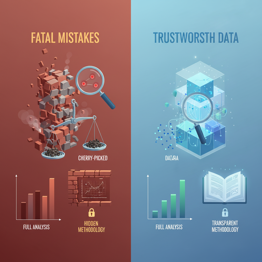
Building a citation-worthy asset takes discipline. Wrecking your credibility takes only one sloppy mistake.
Getting this wrong isn’t just about getting no backlinks; it’s about actively damaging your brand’s reputation. A flawed analysis can lead to disastrous business decisions and a complete erosion of trust. Here are the cardinal sins you must avoid.
Cherry-Picking and Confirmation Bias
This is the most tempting and most dangerous mistake. Cherry-picking data is the act of selectively highlighting figures that support your desired narrative while conveniently ignoring those that don’t. It’s often driven by confirmation bias—our natural tendency to favor information that confirms our existing beliefs. This practice is considered one of the seven deadly sins of research for a reason: it’s deceptive and leads to false conclusions.
- Example: Touting a 300% increase in sign-ups from a new channel while ignoring that the absolute number was only 4 sign-ups and the customer acquisition cost was 10x higher than any other channel.
Misleading Visualizations and Vague Context
You can lie with statistics without ever changing a number. The way you visualize data can fundamentally distort its meaning.
- Truncated Y-Axis: Starting the Y-axis of a bar chart at a value other than 0 to exaggerate differences.
- Inappropriate Chart Types: Using a line chart for categorical data or a pie chart when percentages add up to more than 100%.
- Vague Context: We’ve covered this, but it bears repeating. A chart with no clear title, no labeled axes, and no source is not a helpful visualization; it’s propaganda.
Hidden Methodology and Lack of Benchmarks
If a journalist or researcher can’t find your methodology, they will assume the worst—that your data is flawed, biased, or outright fabricated. A hidden methodology is a giant red flag that screams, “Don’t trust this.”
Similarly, data without a benchmark is often useless. Saying you have a 5% conversion rate means nothing. Is that good? Is that bad? Compared to what? You must provide a comparison point—the industry average, your performance last year, a key competitor—to give your numbers meaningful scale.
Avoiding these mistakes isn’t just about ethical correctness; it’s about strategic survival. In a world of rampant misinformation, becoming a beacon of trustworthy, accurately presented data is your most powerful competitive advantage.
Your Implementation Checklist & Data Hook Creation Service
Knowledge is potential. Action is power. You now have the framework. It’s time to put it to work. Use this checklist as your pre-flight audit before publishing any data-driven content.
- Statistic (S): Is my core number specific, surprising, and tied to a meaningful metric?
- Context (C): Have I clearly defined the Who, What, When, and Where of my data? Is it defensible?
- Implication (I): Does my statistic answer the “So what?” question with a clear business consequence?
- Source & Methodology (S&M): Is my methodology transparent, clear, and easy to find?
- Story Frame: Have I consciously chosen a narrative (Warning, Opportunity, Revelation, Confirmation)?
- The Journalist Screenshot Test: Can my key finding be understood and shared in 3 seconds?
- Ethics Check: Have I avoided all fatal mistakes like cherry-picking and misleading visuals?
Going through this process requires expertise and rigor. It’s the difference between creating world-class, citation-worthy assets and another report that sinks without a trace. If you’re ready to create the kind of data that earns high-authority backlinks and gets you featured in top-tier media, but want expert guidance to ensure it’s done right, we can help.
Our Data Hook Creation Service is the full implementation of the framework you’ve just learned. We handle the entire lifecycle—from ideation and survey design to analysis, narrative crafting, and creating the final, citation-ready asset. We build the engine that powers your data-driven PR and SEO success.
Knowledge is only potential power; action is what creates results. This final step provides the tools and the expert support to turn this powerful framework into your next high-impact marketing campaign.
Creating statistics that get cited isn’t about luck. It’s not about having a massive budget or a team of data scientists. It’s about having a disciplined, repeatable process.
The S+C+I+S&M framework is that process. It’s your blueprint for transforming raw, inert numbers into a company’s most valuable marketing asset. It’s how you move from being a participant in your industry’s conversation to being the source that everyone else cites. By focusing on specificity, providing context, clarifying the implication, and being transparent with your methodology, you build the two things that matter most in a data-saturated world: authority and trust.
Ready to create the data-driven stories that land you in top-tier publications and earn authoritative backlinks? Contact our team to learn more about our Data Hook Creation Service and let us build your next citation-worthy asset.
Frequently Asked Questions
What types of statistics get cited most often by journalists?
Journalists and media outlets are most likely to cite statistics that are specific, surprising, and have a clear, tangible implication. Data that highlights a significant trend, a large monetary value, a counter-intuitive finding, or a direct impact on their audience is far more likely to be cited than generic or vague data points.
How can I make my brand’s data a trusted source for AI and search engines?
To become a data source for LLMs and AI, focus on publishing original research with a transparent methodology. Structure your data clearly on the page using lists and tables, and ensure every statistic is easy to understand and attribute. The goal is to be the primary, most authoritative source for a specific data point, making your page the logical citation for any AI synthesizing information on that topic.
What is the difference between cherry-picking data and highlighting key findings?
Highlighting key findings involves presenting the most significant or relevant results from a complete and honest analysis. Cherry-picking is the deceptive practice of selectively choosing data points that support a desired conclusion while intentionally ignoring contradictory data from the same dataset. The key difference is intent and transparency: highlighting is honest curation, while cherry-picking is biased manipulation.
Why is it so important to publish my methodology?
Publishing your methodology is the single most important way to build trust and credibility. It allows journalists, researchers, and your audience to verify your process, understand the context of your findings, and feel confident citing your data. A transparent methodology demonstrates expertise and a commitment to accuracy, making your work far more authoritative and valuable for statistical link building.
References
- Databox. (n.d.). How to Get Free Backlinks: 15 Strategies That Still Work. Retrieved from https://databox.com/how-to-get-free-backlinks
- Forbes Communications Council. (2022, August 10). Six Tips To Get Media Coverage When You Don’t Have ‘News’. Forbes. Retrieved from https://www.forbes.com/councils/forbescommunicationscouncil/2022/08/10/six-tips-to-get-media-coverage-when-you-dont-have-news/
- Institute of Data. (n.d.). What Does “Cherry-Picking” Mean in Data Analytics? Retrieved from https://www.institutedata.com/us/blog/cherry-picking-in-data-analytics/
- Muck Rack. (2024). The State of Journalism 2024. Retrieved from https://muckrack.com/state-of-journalism-2024
- Radcliffe, D., & Lewis, S. C. (n.d.). The Datafication of Journalism. DataJournalism.com. Retrieved from https://datajournalism.com/read/handbook/two/training-data-journalists/the-datafication-of-journalism
- Sarma, N. (2019, June 25). The seven deadly sins of research. Nature Index. Retrieved from https://www.nature.com/nature-index/news/the-seven-deadly-sins-of-research
- University of Saskatchewan Library. (n.d.). How Reasoning Fails: Statistical Misrepresentation. Retrieved from https://libguides.usask.ca/CriticalThinkingTutorial/HowReasoningFails/StatisticalMisrepresentation


