
If Ferris Bueller was an SEO strategist, he wouldn’t be taking a day off. He’d be staring at a spreadsheet, realizing that life moves pretty fast, and if you don’t update your datasets, you miss the backlink.
We all want that “unicorn” asset. The one chart that gets picked up by The New York Times, cited in 500 industry blogs, and effectively pays for your entire marketing salary in domain authority. I call this the $50K Backlink. It’s not paid for; it’s earned. And its value, calculated by the cost of acquiring equivalent authority through manual outreach, is immense.

But here is the cold, hard reality of the internet: Statistics don’t persuade—framed statistics with context persuade.
Most marketers throw “naked statistics” at the wall. They publish a listicle of 50 stats, pray for traffic, and end up in the digital graveyard. We know this because the data tells us so. The vast majority of content is invisible.
In this deep dive, we aren’t just looking at numbers. We are reverse-engineering the S+C+I+S&M framework. This is the playbook for turning dry data into citation-worthy assets that journalists feel compelled to link to.
Why Most Statistics Die in Obscurity: The Journalist Screenshot Test
Data is data. Until it isn’t.
The “Zero Backlink” phenomenon is the silent killer of content marketing budgets. According to a massive study by Ahrefs, 96.55% of all pages in their index get zero traffic from Google.
Let that sink in. Nearly 97% of the effort poured into the web is effectively screaming into a void.
Why? Because most content fails the “Journalist Screenshot Test.”
Here is the test: If a journalist lands on your page, looks at your chart, and cannot understand the narrative in three seconds, they are gone. They aren’t going to read your 2,000-word preamble. They need a stat to validate their story, not yours.
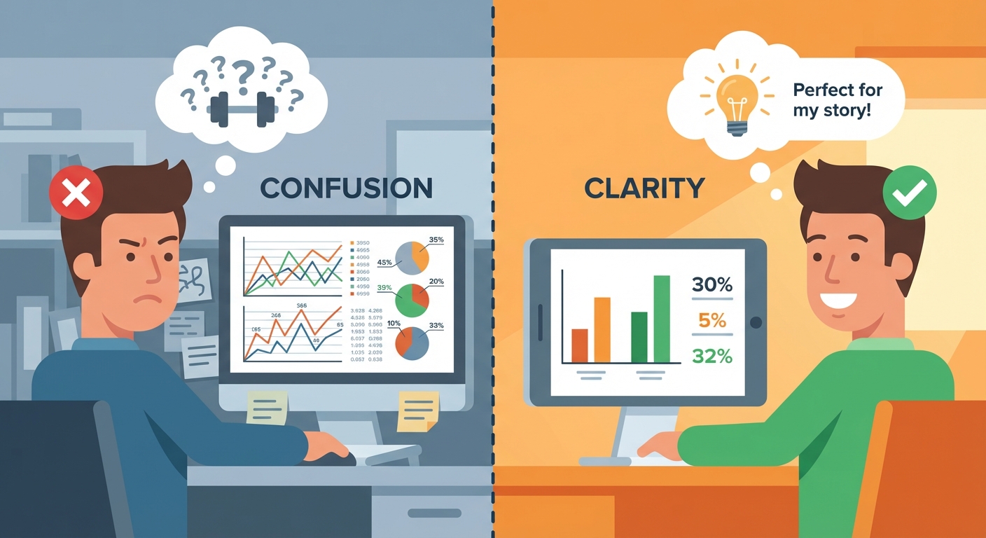
Journalists are starving for data, yet they reject pitches constantly. In fact, 47% of journalists say they seldom or never receive pitches relevant to their beat. The problem isn’t that they don’t want data; it’s that they don’t want cognitive load.
When you publish statistics ignored by journalists, it is usually because you offered them a math problem instead of a headline. You gave them raw ingredients when they ordered a meal.
The Zero Backlink Trap: Topic vs. Execution
The distinction between a page that ranks and a page that rots often happens before a single word is written. It’s the topic selection.
You can rank without backlinks—but only if you target low-competition, long-tail keywords where no one else is playing. For anything with commercial intent, links are the currency.
If you are targeting “marketing trends 2025” without a proprietary data angle, you are bringing a knife to a gunfight. You are falling into the trap of competing on opinion rather than authority. To escape the 96.55%, you must stop writing “content” and start building citation assets.
The difference between a viral asset and a dead page often isn’t the data itself, but the ‘cognitive load’ required to understand it. If a journalist has to do the math to find the story, they will click away to a source that has already done the thinking for them.
The S+C+I+S&M Framework: Engineering Citation-Worthy Statistics
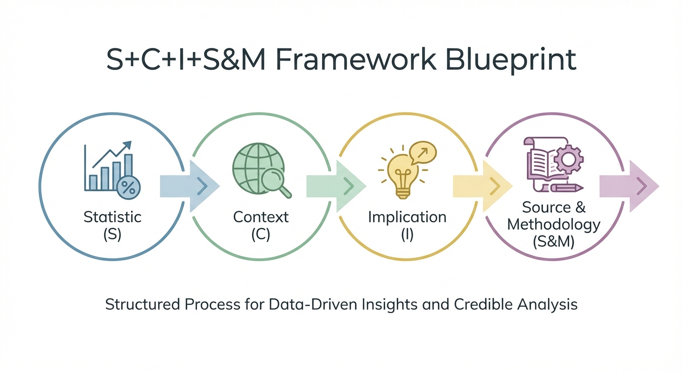
How do you force a journalist to care? You don’t ask nicely. You use psychology.
You use the S+C+I+S&M Framework.
This is the proprietary structure for ensuring your data hits the citation strategy sweet spot. It stands for Statistic, Context, Implication, Source & Methodology.
Let’s break down how to create citation-worthy statistics that act as link magnets.
S (Statistic): Specificity is Velocity
A weak statistic is vague. “Many people like pizza.”
A strong statistic is specific. “98% of Chicagoans prefer Deep Dish.”
Specificity signals truth. It suggests measurement occurred. When looking for link building statistics, you’ll notice the most cited ones are never “most marketers.” They are precise numbers.
Weak: “Most businesses think link building helps.”
Strong: “58% of businesses believe link building has a significant effect on SERP rankings.”
Weak: “Digital PR is popular.”
Strong: “Digital PR has a 48.6% effectiveness rate but only 17.7% adoption.”
The human brain latches onto specific numbers because they feel like hard facts rather than soft opinions.
C (Context): Anchoring the Data
A number without context is floating in space. To make it land, you must use framing statistics for context.
This involves the journalist’s favorite questions: Who? What? Where? When?
If you say “78% of companies,” I don’t trust you.
If you say “78% of Fortune 500 manufacturing COOs in Q4 2024,” I am listening.
This is called Contextual Anchoring. You must anchor your data to a benchmark. Compare it to last year. Compare it to a competitor. Compare it to a goal.
- Bad Framing: “We saw 1,000 visits.”
- Good Framing: “We saw 1,000 visits, a 200% increase over the industry average for new launches.”
By framing the stat, you tell the reader how to feel about it.
I (Implication): The ‘So What?’ Factor
This is where you bridge the gap for the reader. The implication explains the business consequence.
Journalists write stories about change, danger, or money. Your digital PR data must speak that language.
Don’t just report the number. Report the Implication.
- Stat: “Only 17.7% of SEOs use Digital PR.”
- Implication: “This creates a massive ROI gap, where early adopters can dominate high-authority SERPs before the market corrects.”
You are answering “So What?” before they can ask it.
S&M (Source & Methodology): The Trust Signal
In the era of AI hallucinations, writing credible data methodologies is your strongest competitive advantage.
You must adopt the “Open Box Methodology.”
Most marketers hide how they got their numbers because their data is weak. They polled 12 people on Twitter and called it a “study.” Do not do this.
To build E-E-A-T (Experience, Expertise, Authoritativeness, Trust), as outlined in Google’s Search Quality Rater Guidelines, you must show your work.
- State your sample size.
- State your dates.
- Admit your limitations.
Paradoxically, saying “This study is skewed toward US tech workers” makes you more trustworthy, not less. It shows you know what you are talking about. It passes the sniff test for high-tier editors.
Data without context is just noise; data with context is a weapon. By explicitly engineering the ‘Implication’ into your statistic, you effectively write the journalist’s headline for them, making your citation inevitable.
The Four Data Stories: Warning, Opportunity, Revelation, Confirmation
If data is the bricks, narrative is the mortar.
According to Mantis Research, only 39% of brands have published original research in the past 12 months. This is a blue ocean. But to swim in it, you need to know which story you are telling.
Every successful campaign utilizing a data hook creation service or strategy falls into one of four archetypes.
Identifying Your Narrative Arc
-
The Warning: “Winter is coming.”
- Example: “90% of sites are not ready for the new Google Update.”
- Why it works: Fear drives clicks. It signals immediate danger.
-
The Opportunity: “There is gold in them hills.”
- Example: “Video content gets 3x the engagement but is only used by 10% of brands.”
- Why it works: Greed and FOMO. It shows a gap in the market.
-
The Revelation: “Everything you know is wrong.”
- Example: “Long-form content actually ranks worse for these specific keywords.”
- Why it works: Contrarianism. It challenges the status quo.
-
The Confirmation: “I knew it!”
- Example: “Data proves that meetings are killing productivity.”
- Why it works: Validation. It backs up a commonly held belief with hard facts.
You don’t need a PhD to find these stories. You can often find them by re-analyzing authoritative government data sources to find getting backlinks with original data opportunities that others missed.
Identifying your ‘Data Story’ before you collect a single data point is the difference between strategic research and aimless surveying. The most link-worthy content confirms a suspicion or reveals a hidden danger, validating the reader’s worldview.
The Visual Monopoly: Passive Link Acquisition

If you want to own the SERP, you must own the image.
I call this the Visual Monopoly.
When someone searches for “marketing funnel,” they are looking for an image to put in their slide deck. If your chart is the clearest, most authoritative visualization of that concept, you win. You achieve passive link acquisition. You earn links while you sleep.
But you must avoid vague data visualization.
To dominate, you need to use “Visual Honest Signals.”
- Error Bars: Show the margin of error. It looks scientific.
- Data Source Footer: Put the source URL directly in the image.
- Date Stamp: “Data valid as of Q4 2024.”
Adhere to data visualization best practices. Keep it clean. Keep it high contrast. If Tufte wouldn’t like it, delete it.
When you own the ‘Visual Monopoly’ on a concept, you stop chasing backlinks and start attracting them. A single, definitive chart can generate more authority than a thousand outreach emails because it solves a user’s need for instant clarity.
Common Fatal Mistakes & The Stat-Maintenance Model
The road to the $50K backlink is paved with good intentions and terrible execution.
The most egregious mistake? Content marketing for link building that ignores decay.
The High Cost of Data Decay
A statistic is like a carton of milk. It has an expiration date.
If you publish a study in 2021 and never touch it again, by 2025, it is digital trash. Journalists will not cite it. LLMs like ChatGPT will deprioritize it.
You must adopt the Stat-Maintenance Model.
Treat your data pages like software, not blog posts. Push a “release update” every quarter or year. Update the numbers. Change the date in the title tag.
Link building statistics show that content freshness is paramount. Long-form, fresh content generates ~3.5x more backlinks.
Don’t let your asset rot. Refresh it, and you keep the monopoly.
A static statistic is a dying asset; in the age of AI, freshness is a proxy for accuracy. By committing to a ‘Stat-Maintenance’ cycle, you transform a blog post into permanent industry infrastructure that competitors cannot easily displace.
Conclusion
The difference between a $50 backlink and a $50K backlink isn’t luck. It’s engineering.
It is about respecting the S+C+I+S&M framework. It is about understanding that journalists are overworked humans looking for a narrative liferaft.
Stop publishing naked numbers. Start publishing Citation Assets.
If you are ready to stop guessing and start ranking, download our ‘Implementation Checklist’ to audit your next data study, or contact our Data Hook Creation Service to have our team engineer your next citation asset.
Frequently Asked Questions
What is the most common reason journalists ignore data pitches?
Lack of relevance and context. 47% of journalists reject pitches that don’t align with their beat, and many ignore data that requires too much effort to interpret.
How often should I update my statistics for SEO?
We recommend a quarterly review. Freshness is a key citation factor for both human journalists and Large Language Models (LLMs).
Can I generate backlinks with zero budget?
Yes, by utilizing free public datasets (government data, etc.) and applying the S+C+I+S&M framework to find new stories in existing numbers.
What is the ‘Open Box’ methodology?
It is a transparency technique where you explicitly state your sample size, data sources, and limitations to build trust with sophisticated readers and Google Quality Raters.
Disclaimer: The valuation of a “$50K Backlink” is an estimate based on the commercial cost of acquiring high-authority editorial placements via traditional agency models. Results may vary.
References
- Ahrefs. “90.63% of Content Gets No Traffic From Google [Study]”. Ahrefs Blog.
- Muck Rack. “The State of Journalism 2024”. Muck Rack.
- Mantis Research. “State of Original Research for Marketing”. Mantis Research.
- Google. “Our latest update to the quality rater guidelines: E-A-T gets an extra E for Experience”. Google Search Central Blog.


